

The Problem
Oceanwide Expeditions’ initial website is built like a platform for B2B sales- almost like a wikipedia for polar travel built for travel agents and advisors. The content is vast, and covers expeditions, activities, wildlife, experiences, locations, and lots more, but is difficult to navigate and get a grasp of who exactly Oceanwide is, and what it is that they offer.
My Approach
To do a complete overhaul, and restructure the Oceanwide Expeditions website and change it's core to correctly reflect their offer, I wanted to ensure that I approached this with a heavily research-based approach through an extensive user- empathic base, and an extremely thorough understanding of the information architecture and product structure.
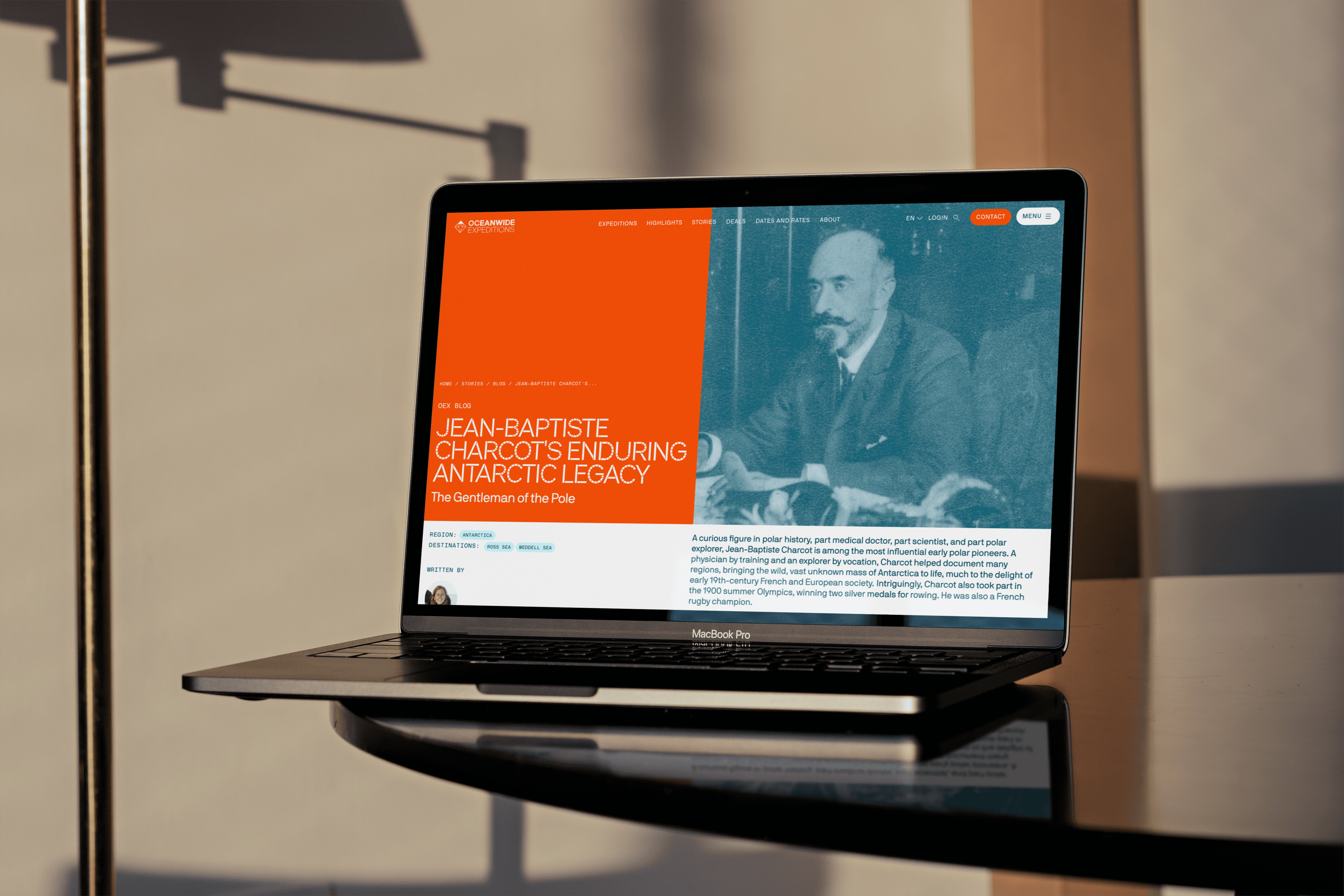
This enabled us to break the website down into it's building blocks, and think through every decision to build it back up in such a way, that the website becomes an Inspirational Storytelling Platform, that helps the user with Guided Exploration, all the way through to having a Seamless Booking Experience.

Inspire
The website needs to make people feel something before they understand it. Showing them the expedition as an emotional, once-in-a-lifetime experience, through immersive photography and real storytelling will inspire the user to explore further and start imagining the journey as their own.
Reassure
Expeditions are not an ordinary holiday. With this mystery of the unknown, and at this price point, trust becomes the foundation of everything. Trusting OEX through credibility of existence, of expertise, and of an assurance of a holistic, “worth it” experience, is very important. Users need to feel that everything will be taken care of.
Reframe
Oceanwide's website is vast, but right now it reads as a sprawl of disconnected facts. Kayaking, whale watching, shipboard meals, lectures, lifelong friendships- the real experience is richer and stranger than what's currently shown, and it's all already there. We need to restructure what already exists so it finally tells the story that's true to Oceanwide.

The Concept
Therefore, we proposed a multi-layered structure: a solid, familiar foundation restructured from their existing site, that lets users find, understand, and book an expedition seamlessly, and a new immersive layer that draws users in and keeps them inspired by the idea of the trip itself.


Product Structure
& Information architecture
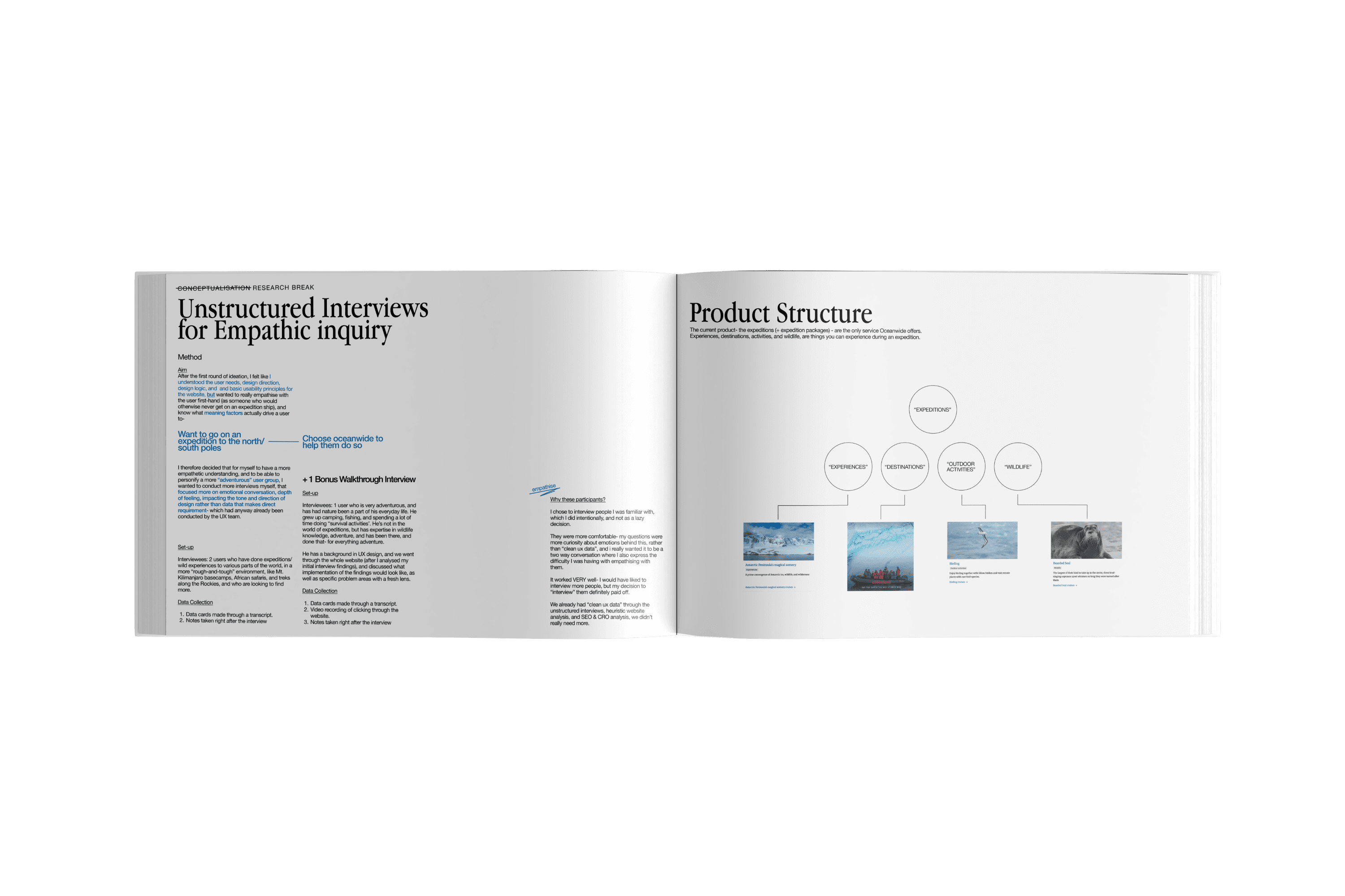
The initial product- the expeditions (+ expedition packages) - are the only service Oceanwide offers. Experiences, destinations, activities, and wildlife, are things you can experience during an expedition.
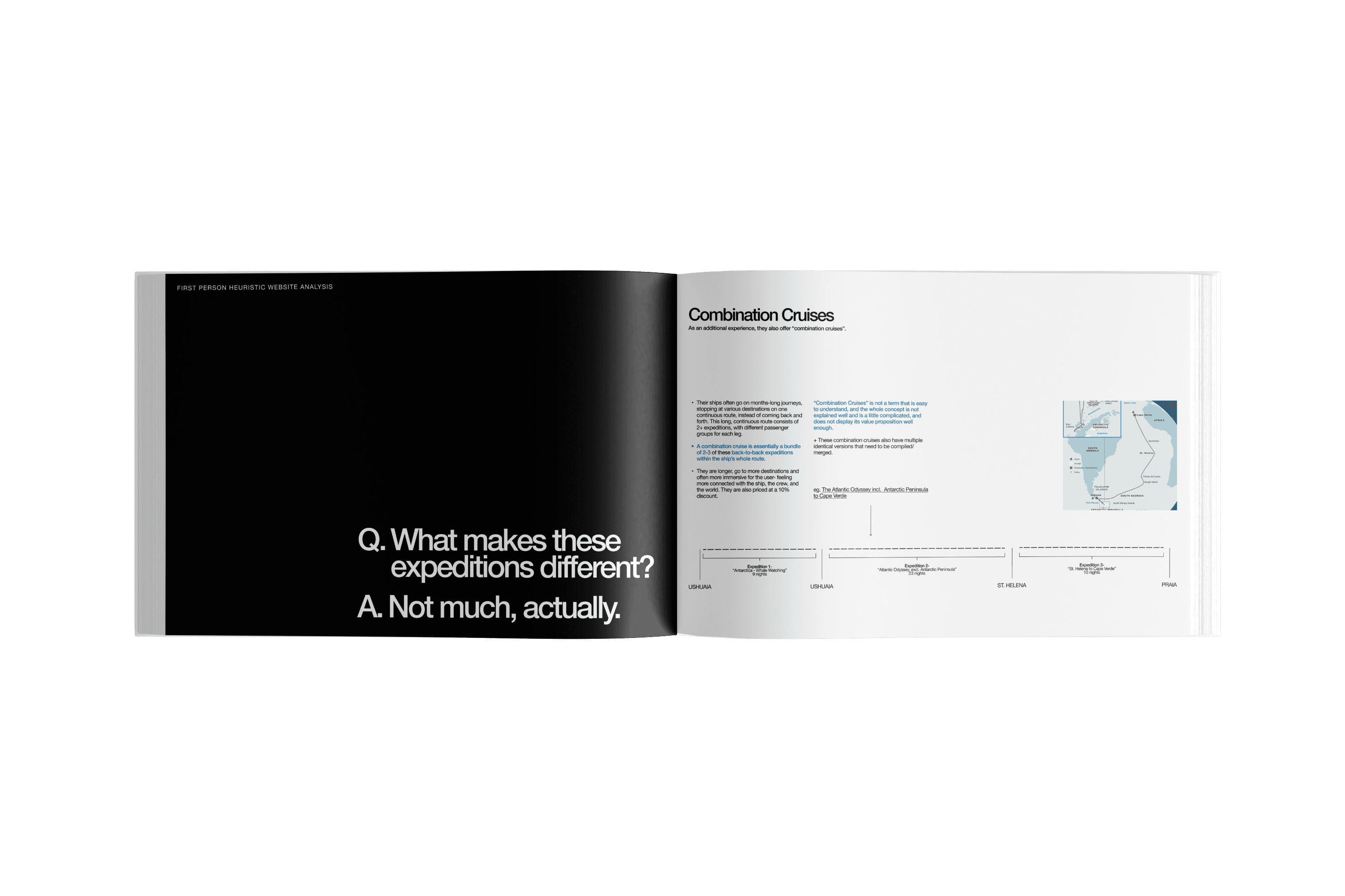
Within these expeditions, discovering expeditions, and identifying differences between various expeditions is very difficult. There is too much information on the expedition cards, and the names, images, details are all very similar sounding- making the experience very confusing, with 190+ expeditions to choose from.


I realised that multiple expeditions, when travelling the same route are basically the same, with just small varying details like dates, 1-2 shifts in days, languages, 1 additional activity, 1-2 added destinations (seasonal dependency- sometimes the ocean is too rough to dock) or a different ship.
The core experience of these are essentially the same. They have the same route, over roughly the same amount of days, with the same landing locations, and have essentially the same experience- the guides talking about the same natural phenomenons.
With a new structure of 20-30 branded "Voyages"- Oceanwide Expedition signatures, expeditions, and departures.

Research
Questions
How does the Oceanwide Expeditions website guide and support users in navigating the complexity of expedition travel?
What is the user’s connection with the emotional side of polar travel, and how does this correlate to the design of the Oceanwide Expeditions website?
Methods
Using Scrum, and the Agile framework-
Heuristic website analysis
Empathic Interviews
Research through Design
Data & Insights
Insights

Emotions over itinerary
People don't want a schedule of activities, they want to feel what the experience would be like. That emotional pull is what actually converts, more than any practical itinerary detail.
Visuals, visuals, visuals
Visuals say a 1000 words-not generic, stock-photo imagery, but of actual pictures of actual passengers on actual expeditions- the human connection people feel on the expedition is very important to help user trust and be inspired by Oceanwide.
The Experience Starts at the First Click
Planning and researching a trip is part of the enjoyment, not just a means to booking it. The website should reward that early curiosity, not just optimize for conversion.
Inspire far-future travellers.
Not everyone browsing is ready to book today- many are years away from affording it. The site should inspire and retain these future travellers, as an established presence that represents the industry.
Trust comes first
At this price point and commitment level, trust is not an addition to the check-list, but becomes a prerequisite for everything.
Thoroughness of Information
Oceanwide's travelers are researchers, not passive browsers. They want deep detail on activities, gear, safety, and logistics before and after booking. This information already exists; it's just hard to find.
"Expedition" Expectation vs. Reality
The website only pictures the loud, obvious moments- zodiac cruising, penguins- and miss the quieter, equally significant ones: lectures, shipboard bonds, unplanned moments. The site undersells half the real experience.
The Ship Is Home Base
With a proud fleet of 4, the ships aren't just transport. They're where passengers sleep, eat, bond, and grow for weeks at a time. They deserve their own storytelling as the heart of the expedition.
A Story, Not a Collection of Activities
The website feels like a menu- activities, wildlife, destinations are all options- disconnected from each other and sold like separate experiences. But the people on the expedition don’t experience it like this. They should all come together to create something larger and more holistic, and continuous.
Once in a lifetime opportunity
For many passengers, this trip is the result of years of financial, mental, and physical preparation- a genuine milestone, not a routine holiday. The site should carry that weight.

Data into Actionable tasks
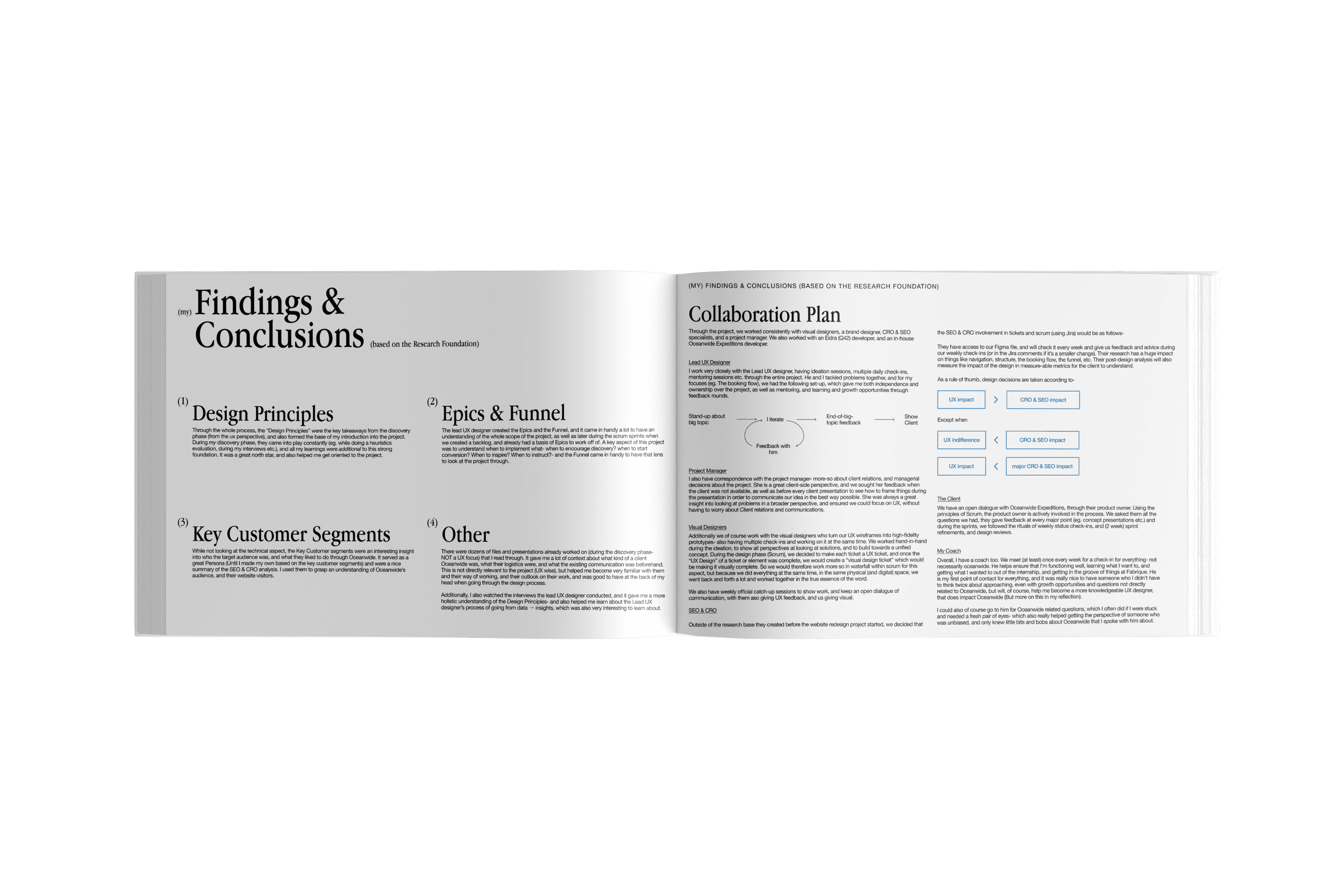
Using these findings, we used the scrum method, and turned them into "Epics" with allocated tasks within.


The single highest-leverage decision: collapsing 190+ expeditions into 20–30 core products, came directly from the heuristic analysis, and reshaped nearly everything after it: navigation, comparison, and what a spatial discovery tool could even look like.
This also encouraged direct interlinking between different pages- users can travel from expedition, to departures, to activity pages, wildlife pages etc. more easily using hyperlinks and natural storytelling.

The booking flow couldn't be solved by insight alone. It took mapping business constraints- shared berths, gendered cabins, multi-leg expedition packages, a high price point- against dozens of edge cases, then designing toward two hard rules from CRO input: show pricing immediately, and don't ask for information before showing options.
This resulted in looking at the flow through two perspectives:

Ultimately, after testing, it lead to following a cabin-first approach, following the principle of progressive disclosure.
Early ideation for a map-based discovery concept came out of the "Emotions over Itinerary" and "Media, Media, Media" insights- the product is inherently spatial and visual, so exploration needed to feel that way too, not like a filtered list.


Other initial ideation started with two routes: visual, and conceptual. The result of this ideation round was the concept of spatial exploration through digital means- using this as our basis for the multi-layered website concept, and the visual concept and style.


Rapid user testing
Rapid Usability testing- short, focused sessions designed to test both usability (can people actually use this?) and desirability (do they want to?) at the same time.
We brought in six participants, deliberately varied across age, travel experience, and comfort with digital tools- from seasoned travellers to people who admitted upfront they weren't confident with maps or unfamiliar interfaces.
Each session moved from an honest first reaction to the concept, through first impressions of the prototype, into a set of directed tasks, and closed with open reflection -what confused them, what they liked, and whether it changed how they felt about the idea of booking a trip like this.
Alongside this, I kept a lighter, continuous feedback loop running through daily stand-ups and quick peer walkthroughs -smaller check-ins that kept every concept honest between formal testing rounds and iterations.
Iterations
The booking flow was the clearest case of iterating against reality rather than taste. What looked like a simple "select passengers, pick a cabin" flow turned into a long list of edge cases the moment real constraints entered the picture- shared berths split by gender, multi-leg packages needing different cabins per leg, groups that didn't divide evenly into rooms. Every edge case either broke an existing design or confirmed it needed to flex further, and the flow only stabilized once it had been stress-tested against nearly every combination the business could actually produce.
The product structure iterated in the opposite direction- starting complex and getting simpler. Early attempts tried to preserve as much of the existing information as possible; the version that actually worked came from repeatedly asking what could be cut, not what could be added, until the underlying model was simple enough to build everything else on top of.
The post-booking experience went through a similar back-and-forth on scope. Early versions leaned heavily practical (documents, payments, logistics), but iterating pulled it toward something more emotional too, balancing functional necessity with the kind of content that kept someone excited between booking and departure, implementing the insights heavily.
The discovery tool iterated around freedom vs. control. Early versions leaned fully into open-ended exploration, reacting to nearly every movement and interaction, which felt exciting to design but confusing to actually use. Each round pulled back a little more toward deliberate action over passive reaction, and toward showing less at once rather than everything at all times- trading some of that initial playfulness for something people could actually orient themselves in, and understand Oceanwide better.
The Graduation Project Report